 Bigger
Guides › Fonts for subtitles
Best Fonts for Video Subtitles and Social Captions
The right font makes captions easy to read in a second. Here is what to look for, which families work, and how to set them in DaVinci Resolve and Premiere Pro.
Updated October 29, 2026 · by The Bigger Studio
Quick answer
- Pick a heavy sans-serif for short vertical videos: wide letters, thick strokes, clear numbers.
- Use one font, two weights at most. Bold for emphasis, regular for the rest.
- Size matters more than style. If you can't read it at arm's length on a phone, it is too small.
- Check the license before you use a font in client work or paid videos.
What makes a font good for subtitles
A subtitle is read in a fraction of a second, over a moving picture, on a screen the size of a hand. That changes the rules. A font that looks elegant on a poster can be unreadable here. Look for these traits:
- Open shapes. Letters like a, e, c and s should have clear openings so they don't blur into blobs at small sizes.
- Even stroke thickness. Very thin lines disappear over busy backgrounds. Very high contrast between thick and thin strokes does the same.
- Large x-height. Tall lowercase letters read faster than small ones at the same point size.
- Distinct numbers. A 1, 7 and 4 that can be confused with other characters cause mistakes in prices and dates.
- Full character support. Accents, ñ, ç, ß and quotation marks should all exist, or your captions will fall back to a different font mid-sentence.
Fonts that work well
These are widely used, free families published under open licenses. Download them from a font library and install them on your computer.
- Montserrat: geometric and friendly. Its bold and extra-bold weights are a safe default for social video.
- Poppins: round and clean, with many weights and a good set of numbers.
- Inter: designed for screens. Excellent for interviews, tutorials and corporate videos.
- Roboto: neutral and familiar. A good choice when you want the text to disappear into the content.
- Anton and Bebas Neue: tall, condensed, all-capital letters. They give a punchy, headline feel, and they fit more words per line.
As a rule, avoid script fonts, very thin weights and decorative display fonts for the main text. If you love a decorative font, use it for one highlighted word and keep the rest simple.
How to choose by type of video
- TikTok, Reels and Shorts: heavy sans-serif, large, usually capitals or a mix. Words appear one by one.
- Interviews and podcasts: a calm, medium-weight sans-serif at a smaller size, one or two lines.
- Tutorials: a very neutral font. The viewer is watching the screen, not the text.
- Brand videos: your brand font, if it passes the readability test. If not, use a close neutral match for subtitles.
Size, color and contrast
A good font can still fail if the color is wrong. White text with a dark outline or a soft shadow is the classic answer, because it works over almost any picture. A solid color box behind the words also works, and it keeps its readability when the background changes quickly. Avoid putting colored text on a similar colored background, and avoid very light colors over bright sky or snow.
Keep captions inside the safe margins. TikTok, Reels and Shorts cover the bottom and the right side with buttons and text, so lift the captions toward the middle of the frame. We explain the exact areas in our safe zones guide.
Change the font in DaVinci Resolve
- Select the subtitle track or a Text+ title on your timeline.
- Open the Inspector and find the font controls.
- Choose the family and the style (bold, extra-bold) from the lists, and set the size.
- Add an outline, shadow or background from the same panel.
The font must be installed on your computer before you open DaVinci Resolve, or it won't appear in the list.
Change the font in Premiere Pro
- Select the captions or the text layer in your sequence.
- Open the Essential Graphics panel, or the Text panel for caption tracks.
- Choose the font family and weight, then set size, fill, stroke and background.
- Save the look as a style so you can reuse it in the next project.
Skip the guesswork with Bigger Subs
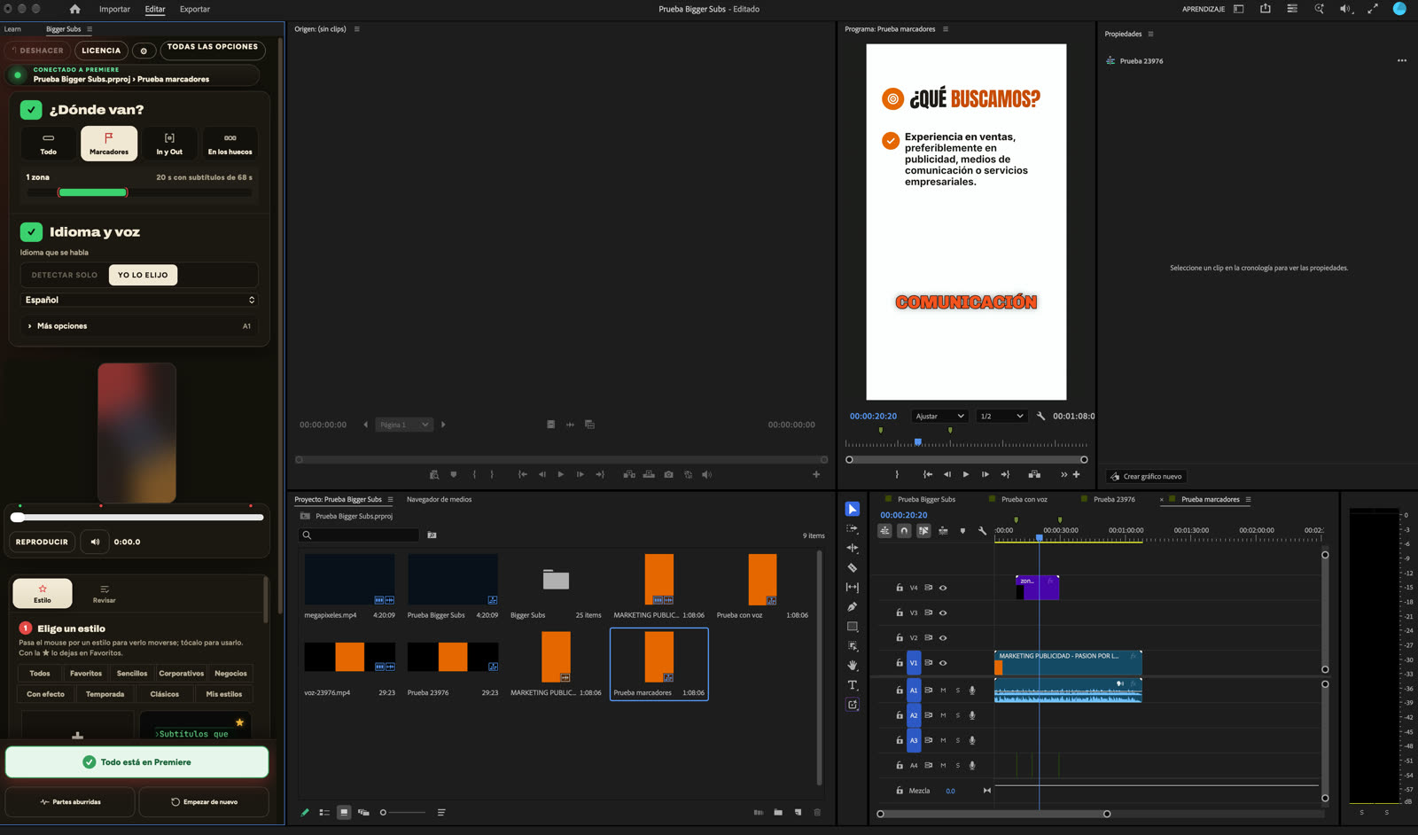
Bigger Subs comes with more than 60 caption styles, and each one is already designed with a font, size, color, outline and animation that work together. You choose one in the gallery and see it over a real frame of your own video before you create it. If you want to adjust the letters, the app has controls for size, weight, color and highlight color, so you can keep the style and still use your own look.
- Open the app and choose where the subtitles go: everything, markers, In/Out points or the gaps.
- Pick the language and a style from the gallery.
- Press create. The subtitles appear word by word on their own transparent track, with key words emphasized and the sounds on another track.
- Review the text and adjust the letters if you need to.
It works in DaVinci Resolve (free and Studio), Final Cut Pro on Mac, and Premiere Pro 2025 or newer on Mac and Windows. The voice is transcribed on your computer, so the video is never uploaded.
A quick test before you publish
Export a short clip and watch it on your own phone, with the brightness low and the sound off. Hold the phone at arm's length. If you can read every word without effort, the font and size work. If you have to squint at one word, make it bigger or choose a heavier weight.
FAQ
What is the best font for video subtitles?
A heavy, open sans-serif such as Montserrat, Poppins or Inter is a safe choice. For short vertical videos, condensed capitals like Anton or Bebas Neue also work well.
What size should subtitles be?
Big enough to read on a phone at arm's length. For vertical video, large letters in two short lines are better than small text in one long line.
Can I use any font in my videos?
Only if its license allows it. Check the license before using a font in client or commercial work. Open-licensed families from font libraries are usually fine.
Do I need to pick fonts myself in Bigger Subs?
No. Every style has its own font and look already tuned, and you can adjust the letters if you want. The preview shows the result on a real frame of your video.
Try Bigger Subs free for 2 days
Mac and Windows. Works with DaVinci Resolve, Premiere Pro 2025 or newer and Final Cut Pro. Everything runs on your computer.
Get the free trialMore guides: Safe zones for TikTok, Reels and Shorts · Hormozi-style captions · CapCut-style captions · TikTok-style captions in Premiere Pro